- About Us
- Corporate Branding
- Digital Branding
- Digital Marketing
- Employer Branding
- Portfolio
- Touchpoints
What we’ve been up to in 2017: SunRice
December 10th, 2017
Another one of our recurring clients this year has been SunRice. During the year, we’ve been involved in a wide variety of projects, ranging from creating ads to contributing to their annual report, designing internal brands and logos, and working on their monthly newsletters.
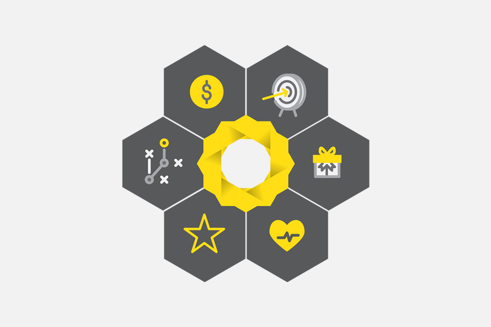
One specific project that we got to work on was to create an internal brand that was modular in design so that each of its individual parts could be usable and meaningful on its own, but could also be put together with other modules and used as part of an overarching brand.
We’re really pleased with the outcome of the project. The icons are recognisable enough so that they have meaning and impact when used in a standalone way, but also simple enough so that when combined with the other 5 modules, they work together to create something more significant and with greater meaning.