One of our long-time clients, SunRice, came to us with an initiative they wanted to launch called ‘Program Velocity’. This initiative is all about moving from old technology to new technology and is setting a benchmark for future similar projects.
They wanted us to design an identity for this initiative that would stand out, but also work well alongside the SunRice logo. This design had to transfer well onto Powerpoint templates and also e-Newsletters, so it needed to be flexible in the way it could be used. We also need the design to work in different colours, based on how the client intended to use the identity, therefore the design and quality needed to be the same, regardless of what colour scheme it was used in.
In the end, we believe we have designed an identity that stands on its own, but also works well in tandem with the main SunRice logo, whilst not being overpowering. As you can see below, the design also works in different colours which fits with how the client wants it to be utilised.
We also created a tagline to accompany this identity. ‘Enabling Technology for Efficiency’.
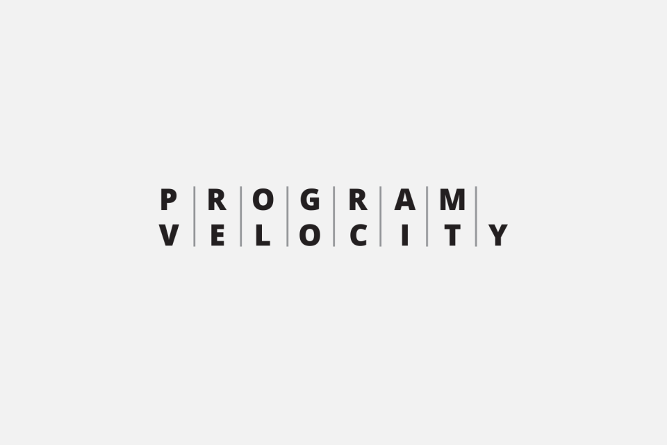
Program Velocity identity
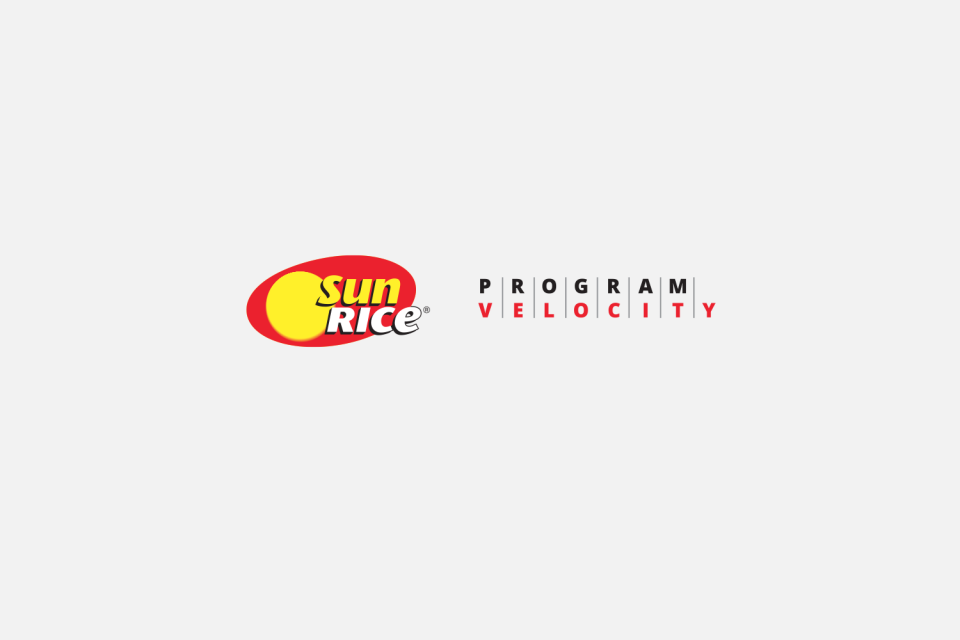
Program Velocity identity in alternate colour to fit with SunRice logo
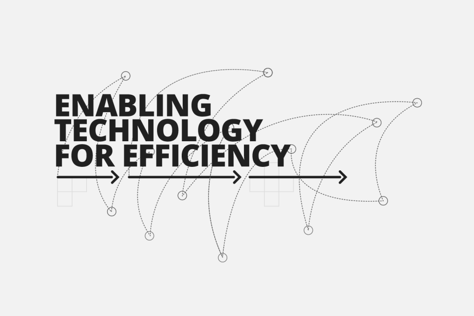
Tagline identity for Program Velocity